

Chapter 5 Communication
 5.1 Communication of well-being indicators can be challenging for countries implementing and maintaining well-being frameworks. There have been calls for guidance and examples of good practices on how to communicate well-being indicators for different users, including policy makers, to optimise the relevancy and use of the well-being frameworks. This chapter includes an overview of communication approaches for well-being frameworks, recommendations for analysis, visualisation and dashboard development and examples of national communication approaches.
 5.1 Overview of communication approaches
5.2 This section considers three aspects of communicating well-being frameworks. Firstly, the stages of communication recommended to develop and maintain a well-being framework are outlined. These are based on the stages for communication of leading, composite and sentiment indicators (UNECE, 2019). Secondly, user segmentation is discussed as an approach that can be used to target communication of well-being indicators to user groups. The user group definitions are based on the European Statistical Advisory Committee (ESAC) classification of users (ESAC, 2015). Thirdly, the types of communication channels and the mapping of these channels to groups using a content strategy are outlined. This is based on the approach in the Statistical Communications Framework for Statistical Institutions (UNECE, 2021).
5.1.1 Communication stages in the development of a well-being framework
5.3 The Guidelines on producing leading, composite and sentiment indicators (UNECE, 2019) suggest four stages of communication, which are also applicable to well-being frameworks. The four stages can be resource and time demanding but increase the likelihood of support for the framework by stakeholders and user groups. Stakeholder engagement in the development of a well-being framework must be balanced with the Fundamental Principles of Official Statistics (UN, 2014), including the requirements of independence, impartiality and transparency. The four stages include:
1. Stakeholder and user consultation - early and active stakeholder and user consultation from the outset of the process in order to ensure appropriate messages are delivered and buy-in. This includes both external and internal stakeholders. This allows stakeholders to provide crucial input on the relevance and potential design and communication of proposed indicators, the domains into which they are placed, and the overall design of the well-being framework.
2. Design and production - iterations which give stakeholders and users multiple opportunities to help shape the final framework. More detailed discussions with internal stakeholders, including technology, communication, dissemination, and statistical subject matter experts, would be recommended at this stage. Well-being frameworks often include indicators from a range of surveys and administrative sources within various business units of an NSO and other agencies. Inclusion of internal stakeholders early in the development process ensures that the overall well-being framework, underlying indicators, and proposed design are feasible and align with the overarching NSO communication, dissemination and technology strategies and policies. It also ensures that the well-being framework is incorporated into ongoing communication calendars and is resourced sufficiently across different teams within an NSO.
3. Dissemination - This will involve not only presenting the indicators, but also providing context, documentation and explanations for the intended users. A key consideration is the complexity of information required to be easily accessible to different user groups. This ranges from high-level indicators for the public to detailed tables and methodological documents for policy makers. The recommended communication and dissemination approaches are expanded upon in the sections on recommendations for visualisation, dashboard development and analysis.
4. Continuous evaluation – this stage is based on an ongoing communication strategy that acknowledges well-being frameworks as statistical products with iterative development and communication cycles. An ongoing dialogue with users is a key to producing high quality statistics that are also policy relevant, especially as indicators may change as scientific knowledge, policy concerns and data availability progress. However, further development, exclusion and inclusion of indicators must be balanced against the needs of stakeholders who may require certain indicators to remain included over time. An ongoing dialogue also aids the visibility and relevance of the well-being frameworks to stakeholders.
5.4 This fourth stage also includes ongoing communication with internal stakeholders responsible for statistical products within the NSO. There are constant developments of these products, with new questions, surveys and administrative sources becoming available, which may be relevant for future iterations of well-being frameworks. Changes may also occur to statistical products linked to the current well-being framework indicators, which should be clearly communicated within an NSO. It is also helpful to exchange communication with colleagues in other NSOs, given potential similarities in best practice for well-being frameworks.
5.5 The ongoing communication may be formalised in the NSO communication plan. This could include requirements to review the well-being framework at specific intervals, publish regular press releases, and actively engage with key stakeholders, including policymakers, through attendance and seminars, creation of bespoke analysis and active engagement with stakeholders on potential improvements to the well-being frameworks.
5.1.2 Communication for stakeholders, users and audience
5.6 Understanding the different needs of stakeholders, users and audiences is a useful starting point when targeting communications. NSOs will have differing relationships and communication approaches with each of these cohorts; thus, a broad overview is outlined in the following sections. The Strategic Communication Framework for Statistical Institutions (UNECE,2021) defines stakeholders, users and audience as follows:
5.1 Overview of communication approaches
5.2 This section considers three aspects of communicating well-being frameworks. Firstly, the stages of communication recommended to develop and maintain a well-being framework are outlined. These are based on the stages for communication of leading, composite and sentiment indicators (UNECE, 2019). Secondly, user segmentation is discussed as an approach that can be used to target communication of well-being indicators to user groups. The user group definitions are based on the European Statistical Advisory Committee (ESAC) classification of users (ESAC, 2015). Thirdly, the types of communication channels and the mapping of these channels to groups using a content strategy are outlined. This is based on the approach in the Statistical Communications Framework for Statistical Institutions (UNECE, 2021).
5.1.1 Communication stages in the development of a well-being framework
5.3 The Guidelines on producing leading, composite and sentiment indicators (UNECE, 2019) suggest four stages of communication, which are also applicable to well-being frameworks. The four stages can be resource and time demanding but increase the likelihood of support for the framework by stakeholders and user groups. Stakeholder engagement in the development of a well-being framework must be balanced with the Fundamental Principles of Official Statistics (UN, 2014), including the requirements of independence, impartiality and transparency. The four stages include:
1. Stakeholder and user consultation - early and active stakeholder and user consultation from the outset of the process in order to ensure appropriate messages are delivered and buy-in. This includes both external and internal stakeholders. This allows stakeholders to provide crucial input on the relevance and potential design and communication of proposed indicators, the domains into which they are placed, and the overall design of the well-being framework.
2. Design and production - iterations which give stakeholders and users multiple opportunities to help shape the final framework. More detailed discussions with internal stakeholders, including technology, communication, dissemination, and statistical subject matter experts, would be recommended at this stage. Well-being frameworks often include indicators from a range of surveys and administrative sources within various business units of an NSO and other agencies. Inclusion of internal stakeholders early in the development process ensures that the overall well-being framework, underlying indicators, and proposed design are feasible and align with the overarching NSO communication, dissemination and technology strategies and policies. It also ensures that the well-being framework is incorporated into ongoing communication calendars and is resourced sufficiently across different teams within an NSO.
3. Dissemination - This will involve not only presenting the indicators, but also providing context, documentation and explanations for the intended users. A key consideration is the complexity of information required to be easily accessible to different user groups. This ranges from high-level indicators for the public to detailed tables and methodological documents for policy makers. The recommended communication and dissemination approaches are expanded upon in the sections on recommendations for visualisation, dashboard development and analysis.
4. Continuous evaluation – this stage is based on an ongoing communication strategy that acknowledges well-being frameworks as statistical products with iterative development and communication cycles. An ongoing dialogue with users is a key to producing high quality statistics that are also policy relevant, especially as indicators may change as scientific knowledge, policy concerns and data availability progress. However, further development, exclusion and inclusion of indicators must be balanced against the needs of stakeholders who may require certain indicators to remain included over time. An ongoing dialogue also aids the visibility and relevance of the well-being frameworks to stakeholders.
5.4 This fourth stage also includes ongoing communication with internal stakeholders responsible for statistical products within the NSO. There are constant developments of these products, with new questions, surveys and administrative sources becoming available, which may be relevant for future iterations of well-being frameworks. Changes may also occur to statistical products linked to the current well-being framework indicators, which should be clearly communicated within an NSO. It is also helpful to exchange communication with colleagues in other NSOs, given potential similarities in best practice for well-being frameworks.
5.5 The ongoing communication may be formalised in the NSO communication plan. This could include requirements to review the well-being framework at specific intervals, publish regular press releases, and actively engage with key stakeholders, including policymakers, through attendance and seminars, creation of bespoke analysis and active engagement with stakeholders on potential improvements to the well-being frameworks.
5.1.2 Communication for stakeholders, users and audience
5.6 Understanding the different needs of stakeholders, users and audiences is a useful starting point when targeting communications. NSOs will have differing relationships and communication approaches with each of these cohorts; thus, a broad overview is outlined in the following sections. The Strategic Communication Framework for Statistical Institutions (UNECE,2021) defines stakeholders, users and audience as follows:
•
Stakeholders are primarily those with an interest in the NSO’s business. They can be individuals, groups or organizations that are affected by the activity of the business, as well as providers of its data.
•
Users are defined as persons or organizations that receives a service. For example, accessing an NSO’s website to acquire data. When researching users, it can be helpful to understand who they are and what they are trying to do; how they currently do it (for example, what services or channels they use); the problems or frustrations they experience and what services they need from the NSO to achieve their goal.
•
Audience is the term typically used for those receiving the communication. This could be a particular user group (for example, applicants to a particular service) or a group of stakeholders (e.g., policymakers). It may also refer to the public in general.
Types of users by statistical products
5.7 Table 5.1 maps user groups (ESAC, 2015) and statistical products, such as dashboards, infographics, microdata and international publications. Table 5.2 maps user groups and communication channels, including press releases, seminars and social media.
Table 5.1
Types of users by statistical products
Types of users by statistical products
|
|
Statistical Products
|
||||||
|
Infographic
|
Dashboard
|
Indicators
|
Metadata
|
Microdata
|
Links to related NSO publications
|
Links to international publications
|
|
|
Institutional Users
|
|||||||
|
Internal NSO Stakeholders
|
X
|
|
|
|
|
|
|
|
Government Agencies
|
X
|
X
|
X
|
X
|
|
X
|
X
|
|
Policymakers within Government Agencies
|
X
|
X
|
X
|
X
|
X
|
X
|
X
|
|
Other NSOs
|
X
|
X
|
X
|
X
|
|
|
X
|
|
Other International Stakeholders (OECD, UN, etc.)
|
X
|
X
|
X
|
X
|
|
|
X
|
|
Non-institutional users
|
|||||||
|
Users with a general interest
|
|
||||||
|
Journalists and Media
|
X
|
X
|
X
|
|
|
|
|
|
Citizens
|
X
|
X
|
X
|
|
|
|
|
|
Students and Teachers
|
X
|
X
|
X
|
X
|
|
X
|
X
|
|
Users with a specific subject/domain interest
|
|||||||
|
Other decision-makers
|
X
|
X
|
X
|
X
|
|
X
|
X
|
|
Policy analysts
|
X
|
X
|
X
|
X
|
X
|
X
|
X
|
|
Experts in a specific field
|
|
X
|
X
|
X
|
X
|
|
|
|
Users with a reuse and reproduction interest
|
|||||||
|
Other producers of official statistics
|
X
|
X
|
X
|
X
|
X
|
X
|
X
|
|
Private or government organisations providing information services/products.
|
X
|
X
|
X
|
X
|
X
|
X
|
X
|
|
Other providers of information services (e.g., App builders)
|
|
|
|
X
|
X
|
X
|
X
|
|
Users with a research interest
|
|||||||
|
Academics and Researchers
|
|
X
|
X
|
X
|
X
|
X
|
X
|
|
Consultants in Governmental Agencies or Private Sector
|
|
X
|
X
|
X
|
X
|
X
|
X
|
Table 5.2
Types of users and communication channels
Types of users and communication channels
|
|
Communications Channels
|
|||||
|
Press Releases
|
Social Media
|
Policy- Based Reports
|
Ad hoc Reports and Queries
|
Liaison Groups
|
Seminars
|
|
|
Institutional Users
|
||||||
|
Internal NSO Stakeholders
|
|
|
X
|
X
|
X
|
|
|
Government Agencies
|
X
|
X
|
X
|
X
|
X
|
X
|
|
Policymakers within Government Agencies
|
X
|
X
|
X
|
X
|
X
|
X
|
|
Other NSOs
|
X
|
X
|
X
|
X
|
X
|
X
|
|
Other International Stakeholders (OECD, UN, etc.)
|
X
|
|
X
|
X
|
X
|
X
|
|
Non-institutional users
|
||||||
|
Users with a general interest
|
||||||
|
Journalists and Media
|
X
|
X
|
|
|
|
X
|
|
Citizens
|
X
|
X
|
|
|
|
|
|
Students and Teachers
|
X
|
X
|
|
X
|
|
|
|
Users with a specific subject/domain interest
|
||||||
|
Other decision-makers
|
X
|
X
|
X
|
X
|
X
|
X
|
|
Experts in a specific field
|
X
|
X
|
X
|
X
|
X
|
X
|
|
Policy analysts
|
X
|
|
X
|
X
|
X
|
X
|
|
Users with a reuse and reproduction interest
|
||||||
|
Other producers of official statistics
|
|
|
X
|
|
X
|
X
|
|
Private or government organisations providing information services/products.
|
|
|
|
|
|
X
|
|
Other providers of information services (e.g., App builders)
|
|
|
|
|
|
|
|
Users with a research interest
|
||||||
|
Academics and Researchers
|
X
|
X
|
X
|
X
|
|
X
|
|
Consultants in Governmental Agencies and the Private Sector
|
X
|
|
X
|
X
|
|
X
|
5.8 Well-being indicators must be clear and understandable for the user. The indicator's message should also convey the specific context of that indicator within a well-being framework. Indicator-based communication has both an informative function, where the communication is used to inform target audiences, and a societal function, where communication is used to assess societal trends and allow different social groups to participate in the governance of society with a better-informed opinion. Thus, indicator-based communication cannot be regarded simply as information transmission but as a specific type of communication with a high societal engagement (Eurostat,2015).
5.9 Traditionally, NSOs have provided descriptive statistical information, without analysis or interpretation, allowing users to interpret the data themselves. The selection and analysis of the indicators must have the potential for communication of the indicators as a priority. Well-being indicators are deceptively complex, and it is crucial that the indicators are communicated in a clear form that meets users’ needs and with sufficient documentation and explanation to facilitate correct interpretation and use of the indicators and avoid misunderstandings. In this regard, it is also helpful to develop the capacity in statistical storytelling tailored to the needs of different users. It is important that changes in methods or individual indicators are communicated to users in a timely and clear way. The communication should include a description of the applied methodology and the component series of the composite indicator.
5.10 There are key principles for clearly communicating all types of indicators:
•
The indicator title should be clear, succinct, and non-technical.
•
If indicator titles must be technical, then additional explanatory techniques, such as metacommunication, should be used to convey the message to the wider audience.
•
There should be a short narrative or brief textual explanation accompanying the indicator.
•
Simple infographics may accompany the indicator.
•
Directional information, via text or infographics (e.g., good/bad, up/down) using traffic lights, colours or arrows may be included. This provides the user with the necessary information to assess the actual development shown by the indicator.
•
Graphical representation of the data by demographics of interest.
5.11 Metadata and links to relevant sources related to the indicator should be easily accessible. Metadata contains essential information needed to understand and effectively use the data. Users must be able to understand ‘at a glance’ the possibilities and limitations of using indicators, especially when used for decision making. As noted earlier, there is often alignment between well-being indicators, which may be reported publicly, such as the SDGs. Including explanations of the relationship and links is helpful for users where these are disseminated separately
5.12 Statistical indicators, which are used for specific purposes, require specific metadata. In particular, indicator metadata should provide a deeper focus on the context in which the indicator is used (e.g., monitoring a policy strategy) and the exact definition and explanation of the indicator-specific methodology, information which is normally not included in the metadata of data sets. On the other hand, methodological details on the underlying sources, normally included in metadata for data sets in general, may be less relevant for indicator-specific documentation. Types of metadata include, but are not limited to:
•
Links to and information on the underlying tables and datasets
•
Links to the source statistical publication.
•
Links to the relevant methodological documentation,
•
Links to external comparative data (e.g., Eurostat tables), where relevant
•
Links to other governmental well-being framework publications, where relevant
5.13 When communicating well-being indicators, it is important to consider their timeliness and frequency, and to what extent published indicators meet user needs for timely information. Some countries and organizations have taken steps to improve data timeliness: the OECD maintains a quarterly updated dataset with over 80 well-being indicators across 41 countries, while Ireland’s Well-being Information Hub provides real-time updates through interactive charts linked to its open data platform, and the Netherlands integrates well-being metrics into its Sustainable Development Goals monitoring system. Timely data is essential for effective communication, as dashboards and reports tend to lose their usefulness when data becomes dated.
5.2 Recommendations for visualisation
5.14 Visualisation can be standalone or integrated into a well-being framework, and can provide a simple, visual overview of indicators while also adding further context to the indicators and dimensions. Visualisation approaches and tools used will be dependent on national considerations, availability of visualisation tools and alignment with NSO dissemination and communication policy. Audio-visual content, including videos and podcasts, are also a potential avenue of communication but are not explored in detail in this section.
5.15 Visualisations including graphs, bar charts, line charts, etc., can be integrated into a well-being framework and aid in both the interpretation of the indicator and provide more detailed comparative or time series data. Where possible, these visualisations should be dynamic and directly linked to live source data sets. This reduces the manual burden of updating well-being frameworks and aids in their communication. The choice of graph accompanying indicators or dimensions will be dependent on national requirements. Infographics should be used to tell a story, be clear and very concise, and include a small number of indicators with illustrations to describe those indicators. Infographics may be more useful in describing indicators within specific dimensions, as the inclusion of too many indicators will decrease the effectiveness of an infographic.
5.3 Recommendations for dashboard development
5.16 The recommendations for the dashboard development are referenced from the United Kingdom Office for National Statistics Data visualisation guidance14.
5.17 Dashboards are a very useful tool in the communication of well-being frameworks as they allow for the communication of a large range of indicators in one place. They may be linked to live data, or they may require manual intervention. In both cases, dashboards require ongoing oversight and maintenance. The design should be carefully considered and incorporated into the development of the well-being framework at an early stage. User needs should be clearly defined in order to develop and prototype a dashboard that meets the needs of the users. Questions include:
•
What will users do with the data?
•
What decisions will users make based on the dashboard?
•
How will they interact with the data?
•
Do they want to explore the data?
•
Do they need the story told to them?
•
What trends do they need to understand?
•
What background information do they need to understand the data?
•
Will users have the time to get insight out of dashboards?
5.18 The design, structure and navigation of dashboards should incorporate how users are expected to navigate and interpret the well-being framework, underlying dimensions and indicators. A format with a chart title, chart and short commentary allows for more context to be given. The focus should be on the important insights. Visual clutter and the amount of scrolling should be minimised.
Metadata should include:
•
the date of the previous update and information about what was updated
•
the date of the next update so that users know when to expect new data
•
a clear, appropriate, and searchable title
•
data reference periods
•
links to definitions, guidance, and methodology
•
appropriate quality information
•
links to other related information
•
commentary or links to commentary
•
important contextual details
•
contact details for the statistician or team
5.19 The indicators within a dashboard are comprised of data from different statistical domains, data sources and with varying frequency and timelines. The timeliness of different indicators on a well-being dashboard and the interpretation of the changes in indicators over time can be challenging for policymakers who are involved in annual or semi-annual budget and policy processes, where the systematic use of the well-being dashboards is a requirement.
5.20 Where a traffic light style presentation is used, for example, green for positive change and red for negative, accessibility can be enhanced through attention to dark/light contrast.
5.4 Examples of national communication platforms and tools
5.21 The recommendations for dashboard development are based on the UK National Well-being Dashboard, available on - UK Measures of National Well-being Dashboard - Office for National Statistics. Below follow examples of communication platforms in Ireland, the Netherlands, Canada and Japan.
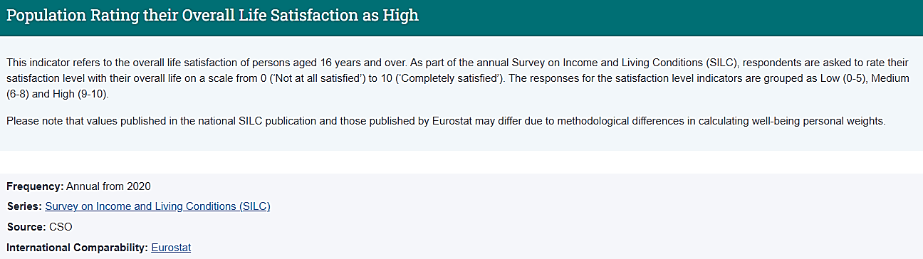
5.22 The Irish Well-being indicators hosted on the Well-being Information Hub were chosen in consultation with the Central Statistics Office (CSO), based on specific criteria and should be seen as an indication of the overall progress towards collective well-being in Ireland. The Government of Ireland has committed to a formal review of the framework after four years, allowing time for the initial dashboard to be used and tested.
5.23 The CSO Well-being Information Hub is one element of the Well-being Framework for Ireland. It was a novel product for the CSO, which allowed for direct linking of interactive charts and reference tables to PXStat, the CSO’s open data platform. This allows for real-time updates of charts when the underlying tables are updated, reducing the manual oversight significantly and maintaining the relevance of the product. The CSO Well-being Information Hub contains 35 indicators across well-being.
5.24 The target audience of the Well-being Information Hub is the general public in the first instance, with links to data sources and metadata for more expert users and policy makers displayed on each indicator page. Graphics are used on all pages of the well-being information hub. The well-being hub does not contain composite indicators.
5.25 The Well-being Information Hub is designed to mirror the structure of the well-being framework. The landing page contains a graphic, a definition of well-being, a note explaining the tagging of sustainable indicators and a menu of all domains and indicators. A snapshot or summary page contains one indicator from each domain and a comparator over time, by demographic or internationally. There is a landing page for each domain with a simple definition and links to all indicators. The long-term change of each indicator is highlighted in a traffic light table. There is also a link to the Well-being Framework of Ireland Portal on the gov.ie website, which is the online repository for all documentation and communication on the broader well-being framework, beyond the statistical indicators.
5.26 Press releases for the Well-being Information Hub are included in the yearly communication plan and are published annually. The press releases are tailored so that the statistician’s comments can be incorporated into media publications with minimal amendments. They are also reviewed by the press team before publication, ensuring that the messages align with the office standards. Social media channels are also used to update users on the day of the press release.
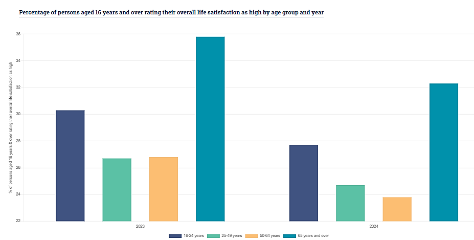
Figure 5.1
Well-being Information Hub – Ireland
Well-being Information Hub – Ireland
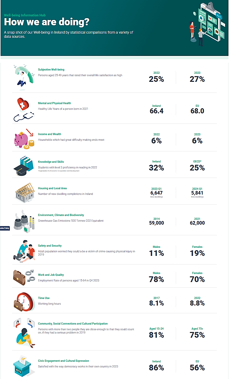
Figure 5.2
Well-being Information Hub, indicator presentation – Ireland
Well-being Information Hub, indicator presentation – Ireland
 5.27 The Dutch Monitor of Well-being and the Sustainable Development Goals uses a dashboard approach. The Monitor measures sustainable and inclusive well-being based on the CES Recommendations on Measuring Sustainable Development (UNECE 2014), distinguishing the three domains of well-being: ‘here and now’, ‘later’, and ‘elsewhere’. It is clear from the recommendations of Stiglitz, Sen & Fitoussi that a composite indicator should not aggregate the domains into one measure.
5.28 In the process of developing the dashboard in 2017, different users were asked about their specific needs. Most stakeholders, particularly politicians, policy makers, and researchers in advisory councils and public assessment offices, preferred a dashboard with individual indicators. They saw no added value in replacing GDP with another single number. Instead, users highlighted the advantages of a dashboard that provides detailed information and allows for an analysis of trade-offs and synergies. In addition to user needs, a major consideration for Statistics Netherlands in deciding not to produce a composite index is that the weights required to aggregate the indicators are inherently normative.
5.29 Three design principles were used to develop dashboards and visualisations. First, keep the visualisations sparse. A minimum of information on each individual indicator prevents users from losing sight of the overall results. Second, use colours that provide intuitive signals to users. The colours green and red are generally recognized as colours that indicate developments that are associated with (respectively) higher and lower well-being. Third, keep the language simple. Metadata was rewritten to provide more understandable descriptions of the most recent figure for each indicator.
5.30 Statistics Netherlands is continuously working to improve and innovate dashboards and visualisations. Interactive visualisations have been tested. The monitor’s website is regularly subjected to user analysis. As part of these experiments, Statistics Netherlands is also looking into the possibilities for using a composite index for communication purposes, as an additional tool rather than a substitute for the dashboard approach.
5.27 The Dutch Monitor of Well-being and the Sustainable Development Goals uses a dashboard approach. The Monitor measures sustainable and inclusive well-being based on the CES Recommendations on Measuring Sustainable Development (UNECE 2014), distinguishing the three domains of well-being: ‘here and now’, ‘later’, and ‘elsewhere’. It is clear from the recommendations of Stiglitz, Sen & Fitoussi that a composite indicator should not aggregate the domains into one measure.
5.28 In the process of developing the dashboard in 2017, different users were asked about their specific needs. Most stakeholders, particularly politicians, policy makers, and researchers in advisory councils and public assessment offices, preferred a dashboard with individual indicators. They saw no added value in replacing GDP with another single number. Instead, users highlighted the advantages of a dashboard that provides detailed information and allows for an analysis of trade-offs and synergies. In addition to user needs, a major consideration for Statistics Netherlands in deciding not to produce a composite index is that the weights required to aggregate the indicators are inherently normative.
5.29 Three design principles were used to develop dashboards and visualisations. First, keep the visualisations sparse. A minimum of information on each individual indicator prevents users from losing sight of the overall results. Second, use colours that provide intuitive signals to users. The colours green and red are generally recognized as colours that indicate developments that are associated with (respectively) higher and lower well-being. Third, keep the language simple. Metadata was rewritten to provide more understandable descriptions of the most recent figure for each indicator.
5.30 Statistics Netherlands is continuously working to improve and innovate dashboards and visualisations. Interactive visualisations have been tested. The monitor’s website is regularly subjected to user analysis. As part of these experiments, Statistics Netherlands is also looking into the possibilities for using a composite index for communication purposes, as an additional tool rather than a substitute for the dashboard approach.
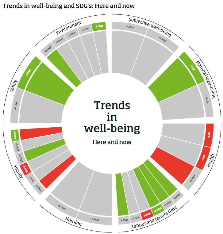
Figure 5.3
Dashboard visualizations of well-being indicators in the Netherlands
Dashboard visualizations of well-being indicators in the Netherlands
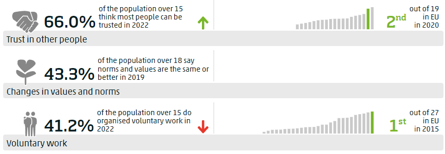
Figure 5.4
Dashboard visualizations of well-being indicators in the Netherlands
Dashboard visualizations of well-being indicators in the Netherlands
 5.31 The Government of Canada uses a dashboard of indicators for its Quality of Life Framework, selected based on evidence of the determinants of life satisfaction. Overall evaluations of life satisfaction and the eudemonic measure ‘sense of meaning and purpose’ are the central measures of the framework, reflecting this underpinning logic. The design of Canada’s Quality of Life framework reflects the broad consensus discussed in the Guidelines on the importance of well-being, inclusion, and sustainability. Future outlook has been added to the framework’s central, overarching domain in a recent review of the framework.
Figure 5.5
Canada - Quality of Life Framework
Canada - Quality of Life Framework
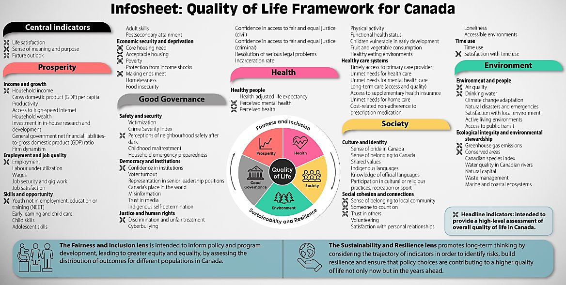 5.32 Well-being: The framework’s 90 indicators are arranged into five domains (prosperity, health, environment, society, and good governance), each of which has several subdomains. A subset of 23 indicators are headline measures which function as a summary set. These include poverty, greenhouse gas emissions, perceived health, perceived mental health, sense of belonging to the local community, and confidence in institutions, among others. Headline indicators provide a high-level summary assessment of Canadian quality of life that can be communicated relatively simply. The indicators are mapped to and closely aligned with the SDGs and other key policy frameworks in Canada.
5.33 Inclusion: Canada’s Quality of Life Framework considers inclusion and sustainability across all domains. The fairness and inclusion lens focuses on the distribution of outcomes among different sub-populations, often through the use of disaggregated data. In addition, some indicators are included that deal directly with equity considerations for particular groups, such as Indigenous self-determination, early learning and child care and representation in senior leadership.
5.34 Sustainability: The sustainability and resilience lens considers the trajectory of these indicators over time as well as risk and protective factors that could negatively or positively influence this trajectory. In addition to these cross-cutting elements, some indicators are included within the framework dashboard that deal more directly with longer-term sustainability considerations such as emissions, debt-to-GDP ratio, and health-adjusted life expectancy.
5.35 The Canadian framework includes both objective and subjective measures, as well as a mix of determinants and outcomes. The framework was originally developed to serve as a tool for budgeting and policy development. It is meant to help policymakers consider the complex relationships between policy, determinants and outcomes, but does not currently attempt to explicitly explain those relationships in a systematic way, though this may be attempted in the future. It is used to monitor trends on these indicators for diagnostic purposes to set policy and budget priorities, for budget ‘tagging’ of the high-level expected outcomes of each budget initiative, and for departmental planning and reporting on outcomes achieved.
5.32 Well-being: The framework’s 90 indicators are arranged into five domains (prosperity, health, environment, society, and good governance), each of which has several subdomains. A subset of 23 indicators are headline measures which function as a summary set. These include poverty, greenhouse gas emissions, perceived health, perceived mental health, sense of belonging to the local community, and confidence in institutions, among others. Headline indicators provide a high-level summary assessment of Canadian quality of life that can be communicated relatively simply. The indicators are mapped to and closely aligned with the SDGs and other key policy frameworks in Canada.
5.33 Inclusion: Canada’s Quality of Life Framework considers inclusion and sustainability across all domains. The fairness and inclusion lens focuses on the distribution of outcomes among different sub-populations, often through the use of disaggregated data. In addition, some indicators are included that deal directly with equity considerations for particular groups, such as Indigenous self-determination, early learning and child care and representation in senior leadership.
5.34 Sustainability: The sustainability and resilience lens considers the trajectory of these indicators over time as well as risk and protective factors that could negatively or positively influence this trajectory. In addition to these cross-cutting elements, some indicators are included within the framework dashboard that deal more directly with longer-term sustainability considerations such as emissions, debt-to-GDP ratio, and health-adjusted life expectancy.
5.35 The Canadian framework includes both objective and subjective measures, as well as a mix of determinants and outcomes. The framework was originally developed to serve as a tool for budgeting and policy development. It is meant to help policymakers consider the complex relationships between policy, determinants and outcomes, but does not currently attempt to explicitly explain those relationships in a systematic way, though this may be attempted in the future. It is used to monitor trends on these indicators for diagnostic purposes to set policy and budget priorities, for budget ‘tagging’ of the high-level expected outcomes of each budget initiative, and for departmental planning and reporting on outcomes achieved.
Figure 5.6
Canada - Quality of Life Framework dashboards
Canada - Quality of Life Framework dashboards
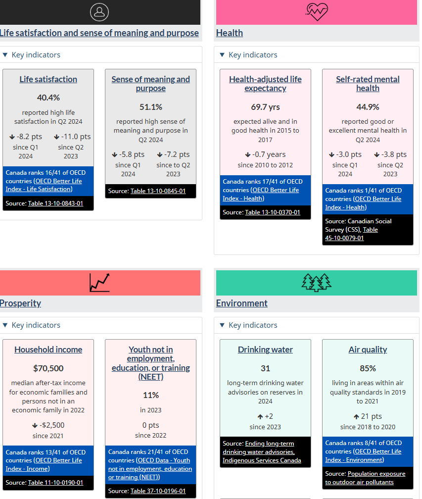
Figure 5.7
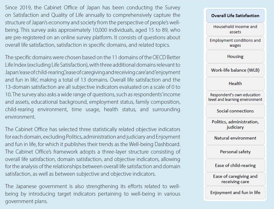
Japan – Overall life satisfaction and domain satisfaction indicators
Japan – Overall life satisfaction and domain satisfaction indicators